
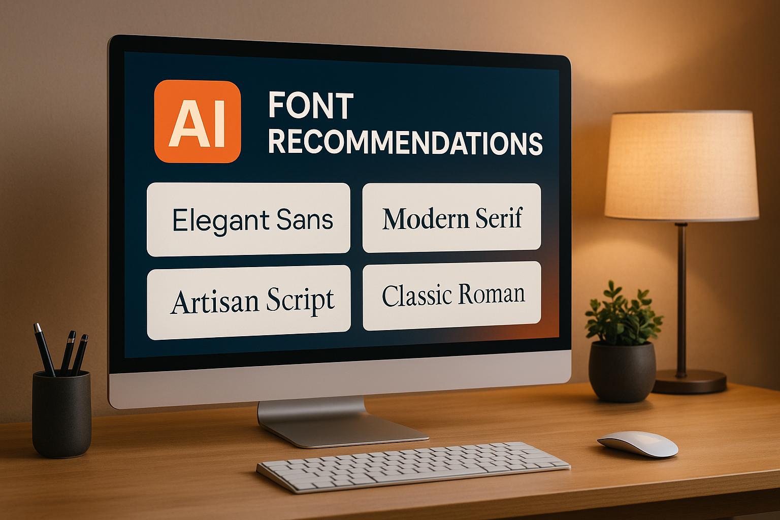
AI font recommendation tools simplify font selection and pairing by analyzing your content, brand, and design context. These tools suggest fonts that enhance readability, align with your brand identity, and create a polished design. They also handle font pairing, ensuring headlines and body text work well together.
Key Features of AI Font Tools:
- Analyze content type, tone, and audience to suggest suitable fonts.
- Use machine learning and NLP to match fonts to your design goals.
- Provide real-time previews for desktop, tablet, and mobile views.
- Offer customization options for font weight, spacing, and line height.
Platforms like Lideroo integrate these tools into no-code editors, making font selection simple and efficient. Whether you’re designing a blog or a business site, AI tools save time and improve your typography without the guesswork.
Design Fundamentals with AI | Choosing Fonts | Adobe
How AI Font Recommendation Tools Work
AI font recommendation tools simplify typography decisions by leveraging advanced technology. These tools, while easy to use, rely on complex processes to deliver precise font suggestions tailored to specific design needs.
Core Technologies Behind AI Font Tools
At the heart of these tools are machine learning algorithms trained on massive datasets of font pairings, design trends, and user preferences. These algorithms analyze successful typography choices from millions of websites, identifying patterns in font combinations that work best for different content types.
Neural networks play a key role in distinguishing subtle differences between fonts. They assess how specific typefaces perform for various uses - whether it's long-form text, headlines, or navigation menus. For example, they know which fonts enhance readability in lengthy articles versus those that grab attention in bold headlines.
Computer vision technology examines the visual context of a webpage, including color schemes, layouts, image styles, and existing fonts. This allows the AI to recommend fonts that complement the overall design aesthetic seamlessly.
Meanwhile, natural language processing (NLP) analyzes the content itself to understand its tone and purpose. Whether the text is formal business material or creative storytelling, NLP ensures the font recommendations align with the intended message and audience.
Steps in the AI Font Recommendation Process
When users engage with an AI font tool, the process begins with an analysis of their inputs - be it design preferences or uploaded content. Here's how it works:
- Content Analysis: The AI evaluates factors like text length, purpose (headlines, body text, captions), and target audience. This helps determine whether the design calls for highly readable fonts, decorative options, or something more stylistic.
- Brand Context Evaluation: If brand guidelines, color schemes, or style preferences are provided, the AI incorporates these into its recommendations. For instance, it knows that financial services often favor more traditional typography, while creative agencies might lean toward bold, expressive fonts.
- Algorithmic Matching: The system compares the analyzed requirements to its vast dataset of successful font combinations. Within milliseconds, it evaluates thousands of options, scoring them based on visual harmony, readability, and contextual fit.
- Technical Refinement: Filters are applied to ensure the recommended fonts meet technical standards like web font compatibility, fast loading times, and responsiveness across devices.
- Ranked Suggestions: The AI generates a list of ranked recommendations, typically offering a primary option alongside alternatives. Each suggestion includes pairings for headlines, subheadings, and body text, creating a cohesive typography system.
This meticulous process ensures the recommendations are both visually appealing and functional, ready for integration into platforms like Lideroo.
Customization and Real-Time Previews
AI font tools don't just stop at recommendations - they allow users to customize and experiment with typography in real time. Users can tweak parameters such as font weight, letter spacing, and line height, while the AI ensures these adjustments maintain the overall balance of the design.
Real-time previews are a game-changer. These tools render changes instantly across mockups for desktop, tablet, and mobile devices, giving users a clear view of how their typography will look in various contexts. This eliminates the trial-and-error guesswork often associated with responsive design.
Another standout feature is adaptive learning. When users accept or reject font suggestions, the AI learns from this feedback, refining its future recommendations. Additionally, the system can make context-aware adjustments. For example, if a user updates their website layout or changes the color scheme, the AI can suggest new fonts to ensure the design remains consistent.
Platforms like Lideroo integrate these capabilities directly into their visual editors, allowing users to explore and implement typography options effortlessly. The combination of customization, real-time feedback, and adaptive learning makes font selection a smooth and creative process.
Benefits of AI-Driven Font Recommendations
AI has reshaped the way we approach font selection, turning what was once a tedious and uncertain process into a streamlined and strategic advantage. For small businesses and entrepreneurs aiming to present a polished, professional image, AI-powered font tools offer noticeable boosts in efficiency, brand alignment, and user experience.
Efficiency and Time Savings
One of the standout perks of AI-driven font recommendations is how much time they save. These tools can quickly analyze your content and suggest fonts optimized for your specific needs, cutting out the need for endless manual testing or guesswork. They also consider technical factors like web font compatibility and loading speeds, simplifying what can often feel like a complex process. For example, on platforms like Lideroo, this means you can build websites faster, allowing you to focus on content creation and broader strategic goals rather than getting bogged down in design details.
Strengthened Brand Consistency
AI doesn’t just pick fonts - it aligns them with your brand’s identity. By analyzing your brand attributes and design objectives, these tools recommend typography that reinforces your visual message. They also suggest font pairings that work well together, creating a clear and cohesive visual hierarchy. This is especially helpful for small businesses without detailed branding guidelines, ensuring that every design element feels intentional. The result? A more unified brand presentation that also improves readability and accessibility.
Enhanced Accessibility and Readability
Another major benefit of AI font tools is their ability to improve accessibility. By tailoring typography to meet the needs of diverse audiences, they make content easier to read for everyone. For instance, a study showed that fonts recommended by FontMART increased reading speeds by 14–25 words per minute, particularly when adjustments like heavier font weights were made for older readers[1][2].
"The future of readability is a device watching humans read and using their performance to tailor the format so that they read at their best."
- Ben Sawyer, Director of the Readability Consortium and UCF's Virtual Readability Lab
On top of that, AI systems automatically check fonts against accessibility standards. They ensure proper contrast, appropriate sizing, and compatibility with screen readers, helping to broaden your audience and boost user engagement. By addressing these details, AI empowers businesses to create designs that are not only visually appealing but also accessible to all.
Integrating AI Font Recommendations into Website Design
Incorporating AI font recommendations can take your website design to the next level. By using these strategies, you can turn typography into a strategic tool that enhances user experience and strengthens your brand identity. Let’s explore how to effectively implement AI-driven font recommendations.
Using AI Fonts with No-Code Builders Like Lideroo
Platforms like Lideroo make integrating AI-recommended fonts a breeze. With its drag-and-drop editor and visual customization tools, you can seamlessly apply fonts to your website. Lideroo offers pre-designed templates featuring well-paired font combinations, which you can tweak to match your brand’s style.
The platform also provides real-time previews, allowing you to see how fonts look across different devices. This ensures that your typography remains sharp and visually appealing, whether viewed on a desktop, tablet, or smartphone.
What’s more, Lideroo’s AI tools can inspire your design process by offering suggestions that align your font choices with your site’s overall aesthetic. It’s a simple yet effective way to ensure your typography works harmoniously with your website's design.
Best Practices for Typography in Web Design
Integrating fonts is only half the battle - applying them correctly is just as important. Here are some key typography principles to keep in mind:
Font hierarchy: Create a clear distinction between headings, subheadings, and body text by varying font sizes, weights, and families. For example, make your main heading at least 2.5 times larger than your body text to establish a strong visual hierarchy.
Contrast ratios: Accessibility matters. Ensure your text meets WCAG standards with a contrast ratio of at least 4.5:1 for normal text and 3:1 for large text. While many AI tools handle this automatically, double-checking can help address any potential issues.
Loading performance: Too many font families can slow down your site. Stick to 2–3 families and use techniques like
font-display: swapin your CSS to display fallback fonts while custom fonts load.Responsive scaling: Make sure your typography adjusts well across devices. Start with a base font size of 16px for mobile body text and use relative units like
emorremfor scalability. Testing your design on actual devices is essential to ensure consistent rendering.
Mapping Fonts to Website Elements
Assigning the right fonts to each website element can guide users’ attention and create a polished look. Here’s a breakdown of how to map fonts strategically:
| Website Element | Font Recommendation | Size Range | Guidelines |
|---|---|---|---|
| Primary Heading (H1) | Brand-aligned serif or distinctive sans-serif | 32–48px | Use for maximum impact; reflects brand style |
| Secondary Headings | Complementary sans-serif or lighter version of primary | 20–32px | Establish hierarchy; improve scannability |
| Body Text | Readable sans-serif or serif | 16–20px | Prioritize readability for longer content |
| Navigation | Clean sans-serif | 14–16px | Ensure quick recognition and mobile usability |
| CTAs | Bold version of heading font or sans-serif | 16–18px | Create emphasis with high contrast |
For navigation menus, sans-serif fonts are a smart choice due to their clarity at smaller sizes. Stick to around 14–16px for optimal readability, especially on mobile devices.
The secret to effective font mapping lies in consistency and simplicity. Instead of using a different font for each element, create variety by adjusting size, weight, and spacing within a limited set of font families. This approach keeps your design cohesive while ensuring a clear visual hierarchy throughout your site.
sbb-itb-dfa823a
Key Features of AI Font Recommendation Tools
AI-powered font tools make choosing the right typography easier with a range of helpful features:
- Smart font pairing: Suggests typefaces that work well together, following established design principles.
- Real-time previews: Provides instant visuals of how selected fonts will look within your design.
- Improved readability and performance: Ensures fonts are easy to read while also optimizing loading times.
For platforms like Lideroo that cater to users without coding expertise, these tools simplify design decisions and help maintain a cohesive visual style. They bring AI-driven typography seamlessly into the web design process.
Conclusion
Key Points Recap
AI tools are transforming the way fonts are selected, making the process faster and more aligned with your content and brand identity. By analyzing elements like design context and branding, these tools take the guesswork out of choosing typefaces. The result? Smart font pairing capabilities that ensure your headlines, body text, and accent fonts blend seamlessly.
These tools don't just save time - they refine your design. In seconds, they sift through thousands of options, presenting only the most relevant fonts. This efficiency not only speeds up the process but also enhances design quality by following established typography principles and ensuring accessibility across all devices.
For website owners prioritizing brand consistency, AI font recommendations are a game changer. They understand how design elements interact and suggest fonts that strengthen your brand's identity, creating a cohesive and polished look.
Together, these benefits point toward a more accessible and efficient future in design.
Final Thoughts on No-Code and AI Typography
The integration of AI typography tools into no-code platforms is reshaping web design, making professional-grade typography achievable for everyone. Platforms like Lideroo bring these advanced tools to users with no formal design experience, empowering them to create visually stunning websites.
This combination of drag-and-drop simplicity and AI-driven font recommendations means you no longer need to hire a designer or spend months mastering typography. You can focus on your content and business goals while the tools handle the technical details.
The future of web design is rooted in intelligent automation. Whether you're building a blog, launching a directory site, or creating any other online project, AI font tools ensure your typography enhances your message, not detracts from it.
FAQs
How do AI font recommendation tools match fonts to my brand and design goals?
AI-powered font recommendation tools take a close look at the core aspects of your brand - like your logo, color scheme, and overall design aesthetic - to suggest fonts that complement and strengthen your brand identity. They also factor in practical elements like readability, tone, and the kind of content your site features, ensuring the fonts align perfectly with your design objectives.
By leveraging sophisticated algorithms, these tools recommend fonts that not only appear polished but also connect with your audience. The result? A seamless and engaging experience that ties your brand’s visual storytelling together.
How can AI-driven font recommendations improve website accessibility and readability?
How AI Can Improve Font Choices for Accessibility
AI-powered font recommendations play a key role in making websites more accessible and user-friendly. By selecting fonts that are easier to read and visually clear, AI ensures that digital content can be enjoyed by a broader audience, including those with visual impairments or reading challenges.
Beyond general improvements, AI can also tailor font selections to match individual preferences or specific accessibility needs. This level of personalization helps enhance comprehension and creates a smoother, more enjoyable experience for users. Ultimately, these tools help make online spaces more inclusive and inviting for everyone.
How do I use AI-recommended fonts in my website design with Lideroo?
Integrating AI-recommended fonts into your website design with Lideroo is straightforward and doesn’t require any coding knowledge. With Lideroo's easy-to-use editor, you can either upload font files directly or embed font code into the design settings. Plus, Lideroo provides access to font libraries like Google Fonts, so applying AI-recommended fonts is quick and hassle-free.
These features make it simple to elevate your website’s look and readability while ensuring a polished and user-friendly design - all in just a few clicks.