
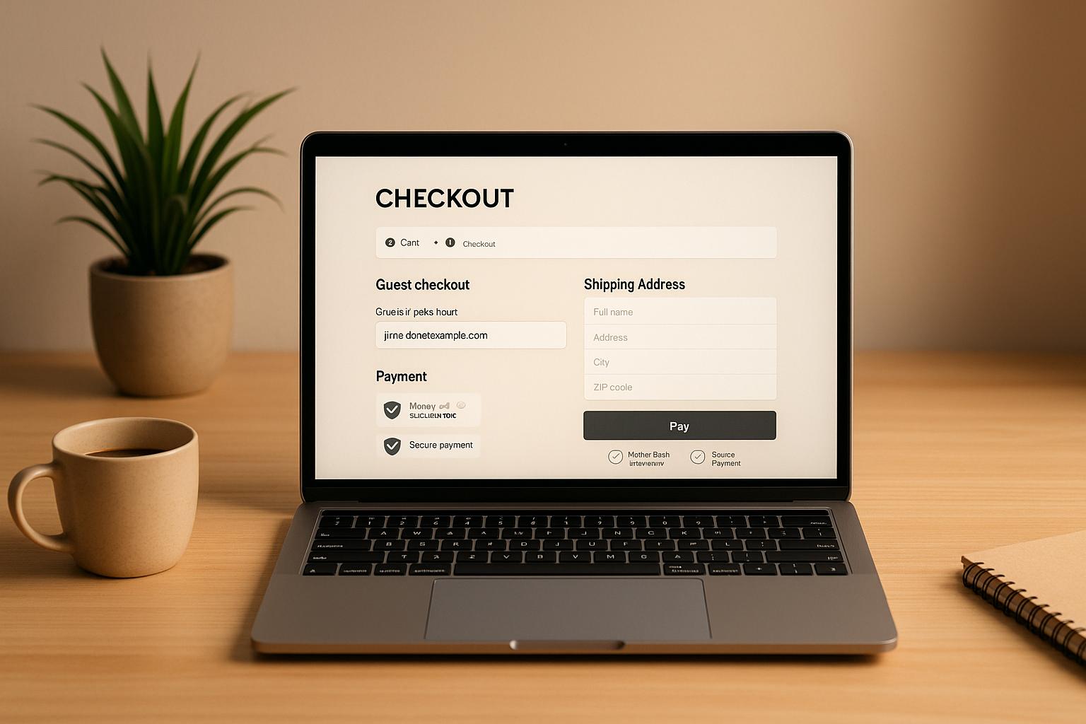
Guest checkout simplifies online shopping by letting users buy without creating an account. This approach reduces friction, speeds up the checkout process, and helps tackle cart abandonment - an issue affecting over 70% of online shoppers. Here's why it's essential and how to get it right:
- Why It Matters: Nearly 1 in 4 shoppers abandon carts due to mandatory account creation. Offering guest checkout can recover these lost sales by making the process faster and less intrusive.
- Key Features:
- Simplicity: Limit required fields to essentials like name, address, email, and payment info.
- Trust: Display security badges, SSL certificates, and trusted payment logos.
- Mobile Optimization: Use single-column layouts, large buttons, and autofill features for seamless mobile use.
- Clear Steps: Include progress indicators to guide users through checkout.
- Payment Options: Offer diverse methods like credit cards, digital wallets (e.g., Apple Pay), and Buy Now, Pay Later services to meet customer preferences.
The Right Way to Design Guest Checkout for Mobile and Desktop
Core Principles of Guest Checkout Design
Designing a smooth guest checkout experience hinges on simplicity, clarity, and building user confidence. These principles ensure U.S. shoppers can complete their purchases quickly, without unnecessary roadblocks.
Keep Design Simple and Focused
A straightforward checkout page can significantly boost conversions. Studies reveal that 23% of users have abandoned a site simply because they were forced to create an account [1]. This makes it essential to prioritize guest checkout as a primary option.
To make guest checkout stand out, use a bold, clearly labeled button - something like "Guest Checkout." Surprisingly, nearly half (47%) of websites offering guest checkout fail to highlight it effectively [3]. Position this option at the top of the page, above any sign-in prompts, to ensure users can easily find it. Additionally, present the guest checkout option before requesting an email address to avoid confusion or early abandonment.
"Allowing users to check out as a 'guest' is key to avoiding unnecessary abandonments, as many users will refuse to create an account simply to check out" [3].
This strategy is critical given that 24% of U.S. online shoppers have abandoned carts due to mandatory account creation [3].
Show Clear Progress Indicators
Progress indicators can make the checkout process feel less daunting by showing users exactly where they are and what’s left to complete. A dynamic, color-coded progress bar that updates as users move through each step creates a sense of clarity and accomplishment.
Place these progress indicators prominently on every checkout page. Use colors to distinguish between completed, active, and upcoming steps, and allow users to click on completed steps to review or edit their information. This not only reduces uncertainty but also makes the process feel manageable, encouraging users to complete their purchase.
Add Trust Signals
Building trust is essential in reducing friction during checkout. Security concerns are a significant factor for American shoppers, with 71% wanting better fraud protection and 64% worrying about data breaches when making online payments [2].
To address these concerns, display SSL certificates prominently and include logos of trusted payment providers like Visa, Mastercard, and PayPal. Use specific security language - phrases like "256-bit SSL encryption" reassure users more effectively than generic terms like "secure checkout." Clearly communicating your data protection measures can help ease shoppers’ worries during the checkout process.
Optimize for Mobile Devices
With mobile shopping on the rise, guest checkouts must be fully optimized for smaller screens. A mobile-friendly design ensures your checkout process works seamlessly for users on the go.
Adopt a single-column layout with large, tappable buttons and logically arranged form fields. Minimize the number of required fields, and enable features like autofill and geolocation for faster address entry. Real-time error validation can prevent submission issues and reduce frustration. For email fields, use input types that display keyboards with the "@" symbol to make typing easier.
The benefits of mobile optimization are clear. Easton Baseball experienced a staggering 659% increase in mobile shopping revenue after improving their checkout process, while Klean Kanteen saw an 80% boost in mobile revenue through similar changes [7]. Supporting express checkout options like Apple Pay can also increase conversion rates by an average of 22.3% [5]. Always test your checkout on real devices to ensure a smooth experience, rather than relying solely on desktop simulations.
Form Fields and User Flow Optimization
To complement a simple design, fine-tuning form fields and optimizing user flow can significantly reduce friction and improve conversion rates. By simplifying forms, you can tackle one of the biggest hurdles - checkout abandonment. With 18% of users leaving their carts due to overly complex forms [9], it's crucial to ensure every field serves a purpose.
Limit Required Information
Did you know most checkouts only need about eight essential fields, but many designs still include over 11? [9] This unnecessary complexity can drive customers away. Stick to the basics: name, shipping address, email, and payment details. Avoid adding extra fields like titles or duplicate phone numbers [8]. For instance, using a single "Full Name" field instead of separate first and last name fields can make the process smoother. Yet, 89% of sites still rely on multiple name fields when one would do the job [9].
Optional fields, like "Address Line 2", can be hidden behind expandable links. In fact, 75% of sites already omit this field by default [9]. Similarly, coupon code fields, which 35% of sites display prominently, can be tucked away since they're often underused [9]. Another smart move? Automatically setting the billing address to match the shipping address unless the user specifies otherwise, as 24% of e-commerce sites unnecessarily display both fields [9].
A great example of this is Adidas, which has a streamlined checkout process [8]. Likewise, Crutchfield's mobile site demonstrates how minimal fields can still deliver an efficient and user-friendly experience [9].
Use Auto-Fill and Address Validation
Auto-fill and real-time address validation can do wonders for speeding up the checkout process while reducing errors. For U.S. customers, ZIP code validation ensures accurate shipping addresses and prevents delivery mishaps.
Using standard field names like 'email,' 'address-line1,' and 'postal-code' enables browsers to auto-fill customer information. This feature saves returning users time by pre-populating forms with their saved data. Real-time validation also helps catch typos immediately, cutting down on failed deliveries and reducing the need for customer support.
Another helpful tip: auto-populate city and state fields based on the ZIP code. This not only minimizes manual input but also ensures accurate shipping and tax calculations.
Display Order Summary at All Times
A persistent order summary is another way to make the checkout process seamless. Shoppers want to see itemized costs, taxes, and the final total (e.g., $49.99) without navigating away from the page.
This transparency builds trust by clearly showing each item's price, quantity controls for adjustments, shipping costs, applicable taxes, and the total amount. When customers know exactly what they’re paying upfront, they’re less likely to abandon their cart due to surprise fees.
One-Page vs. Multi-Step Checkout
Choosing between a one-page and a multi-step checkout depends on your audience and the complexity of your products. Both approaches have their advantages, and understanding these can help you make an informed decision.
| Aspect | One-Page Checkout | Multi-Step Checkout |
|---|---|---|
| Speed | Faster with fewer clicks and page loads | Slower due to multiple transitions |
| Error Rates | Harder to identify drop-off points | Easier to track where users abandon the flow |
| Satisfaction | Can feel overwhelming due to information overload | Offers clear guidance but may frustrate with extra clicks |
| Mobile Experience | Varies in mobile usability | Breaks up content for smaller screens |
| Upselling Opportunities | Limited space for extra offers | Allows for more upselling opportunities |
For example, White Stuff shifted from a three-page to a one-page checkout, resulting in a 100% speed boost on mobile, a 37% increase in conversion rates, and a 26% rise in average order value [4]. Meanwhile, Wreaths Across America opted for a custom multi-step checkout that lets users edit their carts. This change led to a 63% revenue boost, a 28% increase in orders, and a 27.5% rise in average order value [4].
Testing both formats is key to finding the best fit for your customers.
Payment Solutions and Customization Options
A smooth payment process is the backbone of a seamless guest checkout experience. With 76% of consumers expecting flexible payment methods [10], offering the right payment options isn't just a perk - it's a must-have for reducing cart abandonment and securing more sales.
Offer Multiple Payment Methods
Credit cards dominate the U.S. market, making up 70% of online purchases [10]. But relying solely on credit cards could mean losing out on customers who prefer alternatives like digital wallets or Buy Now, Pay Later (BNPL) options.
Digital wallets, for instance, are on the rise, with transactions increasing by 62% year-over-year [10]. These wallets offer speed and convenience, allowing users to complete purchases with just a few taps instead of manually entering card details.
To cater to different demographics, payment options should align with customer preferences. Younger shoppers often lean toward digital wallets like Apple Pay and Google Pay, as well as BNPL services such as Klarna. Meanwhile, older customers tend to favor secure credit card transactions and bank transfers. Smart retailers design their checkout experience with these preferences in mind, prominently featuring the right options for each audience.
Use Proper Currency and Number Formatting
Attention to detail matters, especially when it comes to currency formatting. U.S. customers expect pricing to look like $1,299.99, not $1299.99 or 1,299.99 USD. Consistency in formatting across the entire checkout process - from product prices to totals - helps build trust and reduces confusion.
Proper number formatting isn’t just about aesthetics; it’s about usability. Clear thousand separators (commas) and decimal points make it easier for customers to quickly understand costs. This is especially important for displaying taxes, shipping fees, and order totals. For example, if your checkout shows $49.99, ensure that third-party platforms like PayPal or digital wallets display the same format to avoid discrepancies during the final payment step.
Use No-Code Tools for Customization
No-code platforms have transformed how businesses can refine their checkout experience without needing a development team. Tools like Lideroo allow businesses to create tailored checkout flows using drag-and-drop editors, pre-built templates, and AI-driven features that adapt to specific needs.
Take Primer's Universal Checkout as an example. It lets merchants manage backend logic through a simple dashboard. This includes adding payment methods, setting conditions like enabling Klarna for purchases over $100, and managing multiple payment accounts [11].
This kind of flexibility empowers businesses to design payment rules that align with their operations. For instance, you could offer BNPL options only for orders over $200, limit certain payment methods for international customers, or adjust options based on product categories. With Lideroo, you can also tweak checkout layouts, reposition fields, align color schemes with your branding, and experiment with payment arrangements - all without writing a single line of code. This adaptability lets you respond quickly to customer feedback or seasonal shifts in preferences.
Add Real-Time Validation
Real-time validation is a game-changer for creating a frictionless checkout process. It catches errors as they happen, preventing customers from submitting incorrect information. API-based card verification automates this process, while machine learning algorithms detect anomalies in real-time [12].
In 2023, Orum, a payments firm based in New York, launched a pre-validation service called Verify for the Federal Reserve's FedNow Service. This service validates bank accounts in just 15 seconds before processing payments [13].
Beyond improving the user experience, real-time validation plays a key role in fraud prevention. Jeff Ferguson, CTP, Director of Business Development for Axletree Solutions, explains: "By using API technology and the best available data sources to validate information, payments pre-validation is going to help us mitigate fraud" [13].
Implementing these tools means verifying card numbers and CVV codes as they’re entered, cross-checking billing addresses with card issuer records, and confirming bank accounts almost instantly. Multifactor authentication can also add an extra layer of security without significantly slowing down the process.
sbb-itb-dfa823a
Building Trust and Post-Checkout Experience
Trust doesn’t stop at the "Complete Purchase" button. What happens after checkout plays a big role in turning first-time buyers into loyal customers. In fact, boosting customer retention rates by just 5% can lead to a profit increase of 25% to 95% [16]. That’s why focusing on the post-purchase experience isn’t just a nice-to-have - it’s a smart move for long-term success. Here’s how to make it count.
Add Security and Trust Indicators
Even after the purchase, customers want to feel secure. Include a clear privacy policy and customer support information on checkout and confirmation pages. These small but important details reassure buyers that their data is safe and that help is just a click away if needed.
Offer Post-Purchase Account Creation
Instead of interrupting the checkout process to ask for an account sign-up - something that 42% of sites currently do, often leading to cart abandonment [14] - wait until the transaction is complete. After the purchase, invite guests to create an account by pre-filling their details from the checkout process. This makes registration quick and painless.
For example, Crowne Plaza encourages account creation by highlighting perks like membership discounts available only to registered users [15]. Sweeten the deal with instant incentives, such as a discount on their next purchase or free shipping, to make signing up even more appealing.
Set Up Post-Purchase Communication
The conversation shouldn’t end after the order is placed - it’s just beginning. Post-purchase emails can generate up to 90% more revenue per recipient [18]. Start by sending an order confirmation email within 5–10 minutes, including all the essentials: order number, itemized pricing (e.g., $1,299.99), estimated delivery date (e.g., "Expected delivery: August 15, 2025"), and tracking information if available.
Follow up with shipping updates at key points - when the order is processed, shipped, and out for delivery. These updates not only keep customers informed but also ease any delivery anxieties. Since returning customers spend, on average, 67% more than first-time buyers [16], use these touchpoints wisely. For example, send a delivery confirmation email, a review request 5–7 days after delivery, and a short survey with a small incentive to encourage feedback.
Personalization can make a big impact. Take The Souled Store, for instance. They include fun, themed extras - like a Hogwarts acceptance letter or a copy of the Daily Prophet - with Harry Potter merchandise orders. These thoughtful touches show they understand their audience [17].
For businesses using no-code platforms like Lideroo, setting up automated post-purchase email sequences is simple. These tools let you trigger emails based on customer actions, customize templates to match your brand, and track performance to refine your approach.
The ultimate goal? Build a relationship that goes beyond a single purchase. Studies show it can take up to three purchases to establish brand loyalty [16], so every post-purchase interaction is a step toward creating a lifelong customer.
Conclusion
A well-designed guest checkout can make all the difference in connecting customers with their purchases. With cart abandonment rates exceeding 70% overall - and 63% linked to forced account creation - it's clear that simplifying the guest checkout process is essential [6][4].
The numbers tell the story: mobile basket abandonment hovers around 79% globally, compared to roughly 67% on desktop [19]. And nearly half (48%) of shoppers abandon their orders during checkout when faced with unexpected extra costs [20]. These figures highlight the importance of creating a checkout experience that prioritizes ease, trust, and personalization.
Key Takeaways
To make guest checkout effective, focus on simplicity, trust, and customization. Start by reducing the number of pages and form fields - ask for only the information you truly need. Make the "Guest Checkout" option highly visible, and ensure your process is fully optimized for mobile users.
Building trust is equally important. Use security badges from well-known providers, provide clear shipping cost details early on, and be upfront about your return policies. As Maya Ogranovitch Scott, Senior Product & Solutions Marketing Manager at Ping Identity, puts it:
"A seamless ecommerce checkout process is often the difference between a sale and an abandoned cart." [6]
For businesses that want to improve their guest checkout without heavy development work, no-code platforms like Lideroo offer a practical solution. These tools let you customize your checkout process with drag-and-drop features, add autofill and validation, and ensure your design adapts effortlessly to any device.
Next Steps
Take a close look at your current checkout process to identify areas where simplicity or trust might be lacking. Since 1 in 5 shoppers abandon their carts due to a long or overly complicated checkout [21], even small adjustments can lead to meaningful improvements.
Key actions include making the guest checkout option easy to find, reducing the number of required fields, and ensuring mobile optimization. Beyond the basics, consider advanced tactics like exit-intent pop-ups, cart abandonment email campaigns, and live chat support during checkout.
Your goal is to create a checkout experience that feels effortless and trustworthy. Every detail should guide customers smoothly to completing their purchase while reinforcing their confidence in your brand.
FAQs
How can I make the guest checkout option easy to find for users?
When designing your checkout page, make the guest checkout option stand out right from the start. Place it prominently on the first checkout screen, using clear and straightforward labels such as "Guest Checkout". To grab attention, consider using bold colors or slightly larger text for the button or link. This approach minimizes any potential confusion and makes it easier for customers to continue without the hassle of creating an account, leading to a smoother and more pleasant shopping experience.
What are the benefits of using real-time validation in the checkout process?
Real-time validation makes the checkout process smoother by catching errors as users fill out forms. Instead of letting mistakes slip through, it flags them immediately, saving customers from frustration and reducing the chances of cart abandonment.
When shoppers receive instant feedback, they can fix issues on the spot, keeping the process hassle-free. This creates a better overall experience and increases the chances that they'll complete their purchase.
Why is it important to provide multiple payment options during guest checkout, and how does it affect cart abandonment?
Why Offering Multiple Payment Options Matters
Giving customers a variety of payment choices at checkout isn't just a nice-to-have - it's essential. People have different preferences when it comes to how they pay, and if they don’t see their preferred option, they might just leave their cart behind.
By including options like credit cards, digital wallets (think PayPal or Apple Pay), and even buy-now-pay-later services, you can make the checkout process smoother and more appealing. This doesn’t just lower the chances of customers abandoning their carts - it also improves their overall experience. A more flexible and user-friendly checkout builds trust, encourages them to shop with you again, and can even lead to higher sales over time.